ACME
Fraud Management
Dashboards
Enterprise Product | Data Visualization | Sep 2020 - Oct 2020
About the product
ACME Fraud Management Dashboards help fraud managers optimize the fraud strategy for credit card companies. This product uses AI models to enhance fraud detection and assign suspicious transactions to the right pipeline and analysts for further reviews.
With data visualization and the concept of Machine Learning, this product provides at-a-glance analysis, so fraud managers are no longer involved with error-prone manual reviews. They are able to quickly identify the problem area and take actions to solve them to improve the efficiency and accuracy of the system.
Client
A global analytics software provider partnered with our Interaction Design II course at SJSU for this project.
Deliverables
This is a 4-week project and I worked on interaction design for this project.
Outcomes
“Overall – Very high-quality project. You figured out the minimum info needed and communicated it clearly. It comes across as clean and simple even though there is lots of info.”
— Prof. Daniel Rosenberg
01. What problem am I trying to solve?
We started out with briefs with PM and designers from ACME. They gave us a list of goals.
Introduce a configurable dashboard for the Fraud Manager to assess performance.
Provide quick at-a-glance analysis with the ability to dive deeper into the data.
Allow the user to take make decisions and take action on data.
The Challenge
However… after the debrief, I realized the challenge: How can I translate complex concepts and data into a concrete product that I’m not familiar with?
To understand how the fraud system work and the role of the fraud manager, I drilled down the materials, data table, our shared Q&A doc. Finally, this came out:
02. Who am I building this product for?
Besides learning the domain knowledge, I wanted to understand persona in more depth, I tried to capture more information about the user by asking PM lots of questions on the user’s current process, goals, needs, and pain points. For example:
“Instead of having to react to operational challenges in a knee-jerk fashion, I want to proactively run scenarios and quickly deal with operational challenges.”
— Fraud Manager, Janine
So Janine’s main tasks are…
Easily understand and track the data
Determine system and analyst performance
How fast analysts are working cases
How fast queues are being worked
How the model(s) are performing…
Find the problem areas
Take action to fix the problems to improve the fraud strategy
Reassign analysts
Escalate to the analytic team
But Janine can have many frustrations :(
Lack of visuals: difficult to get reports with clear visuals and see the “big picture”
Lack of findability: hard to find the data she needs
Lack of efficiency: communicate with several different teams to get insights and make decisions
Loss of productivity: switch between lots of tools and software to solve the problem
So how might I help Janine to…
See the big picture?
Make decisions?
Take actions?
03. How did I tackle the problems?
User Stories to Conceptual Model
Based on personas and requirements, I created and broke down user stories into a tasks-focused conceptual model. It helps me…
Visualize the high-level functionalities based on users’ tasks.
Design products with the smallest number of screens and the fewest flow steps possible.
Reduce users’ cognitive load based on consistent and dense language structure.
For example, one user story is “The fraud manager wants to track (action) the queue (object) performance” - “Track” is one action as you can see on the top row, “Queue” is one object on the left column. Each action-object pair represents a task user need to perform. By condensing the matrix, I was able to reduce user’s cognitive load by around 50%.
Next, I need to list the key information of each object, which needs to be shown on the design, and metrics to for the fraud manager to determine how each object is performing.
Last but not least, determine the priority of the tasks - tasks that are performed more frequently by the fraud manager will be more prioritized in the design.
Concept Sketching
Besides visualizing the layout, my main goal was to figure out what type of charts to use for different types of data, and how the charts can provide a high-level performance overview and help the fraud manager take action.
Low-Fi Wireframes
I presented my design process and mid-fi wireframes to my professor and cohort. Some key takeaways including:
Re-consider information hierarchy, what info matters the most and can help her take action?
Use global labels to remove redundancy and noises.
04. Final Design
Visuals
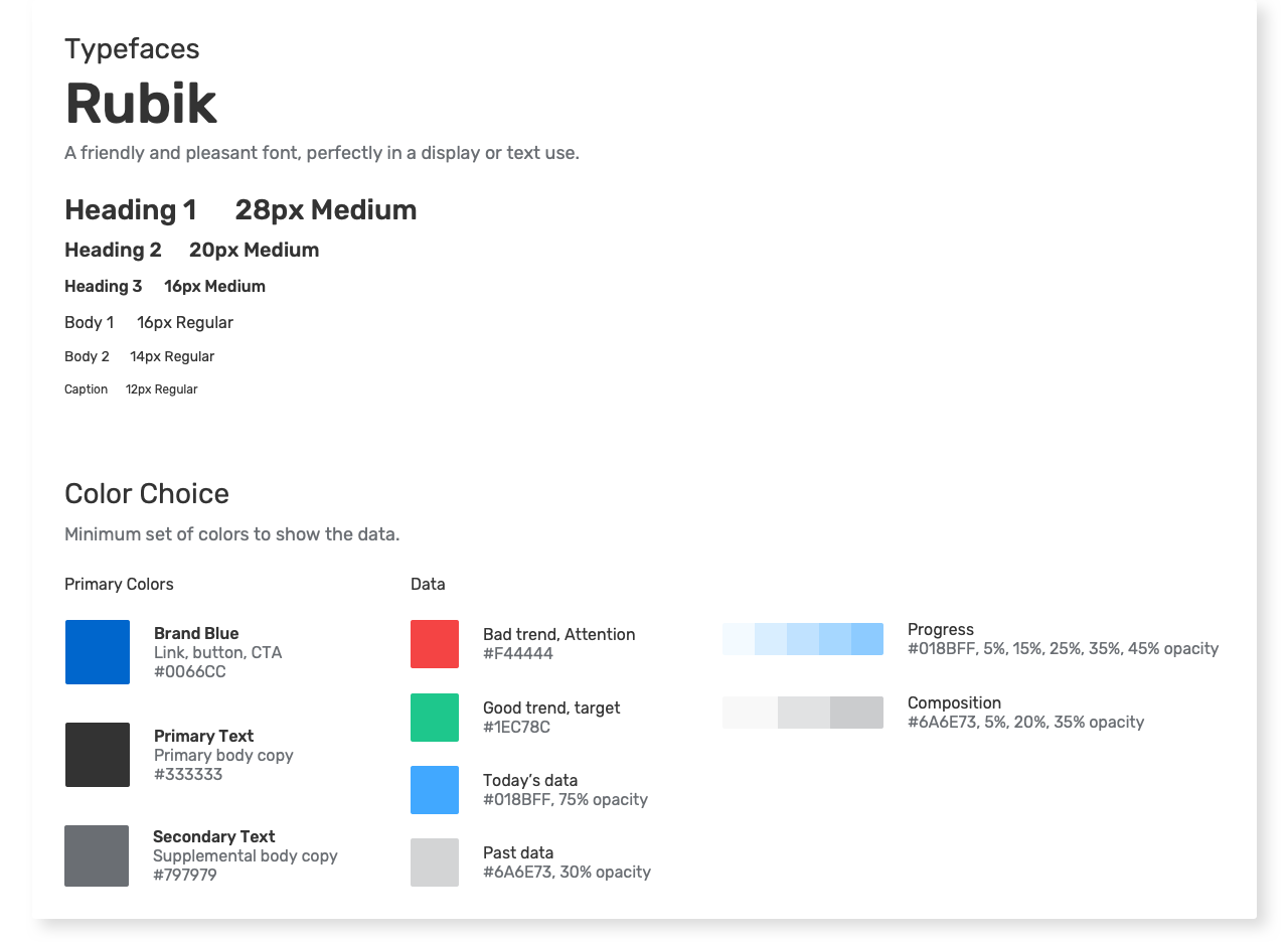
I utilized color theory to select blue as the primary color that instilled a sense of stability and trust. The supporting palette help highlight the important information in the charts.
Grid-to-Grammar Mapping
What puts where matters. This step ensures I can create an effective representation of the Conceptual Model and consistency.
High-Fidelity Prototypes
In the below section, I will show you how my design addresses the previous user issues: see the big picture, quickly make decisions, and take actions.
05. What did I learn?
I learned how to tell an effective story with data – There are so many chart types and each has unique attributes. While one set of data could potentially work with multiple charts, it is important to choose the right chart type that highlights the key information and makes the data clear and concise for the user.
I also learned how to approach a complex problem given limited time and resources – I was able to communicate effectively with the team in a remote environment, think critically, and utilized all sorts of tools and opportunities to ask questions.


